TheraDynamics


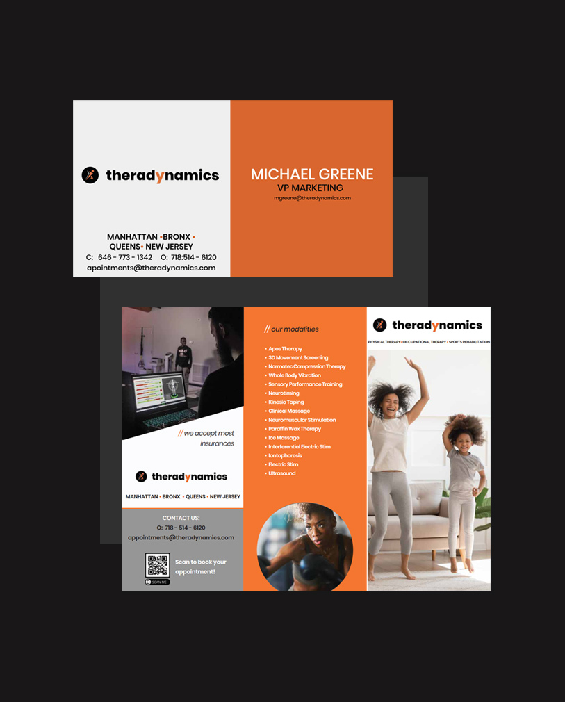
Theradynamics had their physical therapy and rehab staffing company brand established since 1995 and contacted VIO in 2020 to refresh their branding. This started with a logo redesign.

We underwent a Branding Deep Dive to understand their Branding Persona. From there, we designed their logo to communicate their brand as bold, lively, and sharp using the Poppins typeface under a Black weight with an orange highlight to give it an energetic lip.

